5.1. voraus.app //maker
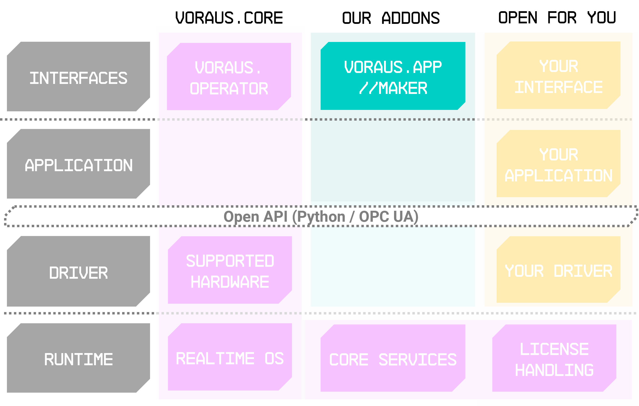
Fig. 39 voraus.app //maker running as addon to the voraus.core
The voraus.app //maker (see Fig. 39) adds a development tool to the voraus.operator: directly integrated into the user interface, you can define your own graphical function blocks, behind which your custom Python scripts are hidden. This keeps the programs clear at all times. You can also add an individual, freely configurable user interface to your Python code. New capabilities for your gripper, mathematical calculations or even step-by-step instructions for setting up your process can be easily implemented with this extension.
Note
The use of the app requires the voraus.operator, which is preferably bundled with a voraus.core.
Benefits
Simplified Development – Developers can streamline the process of defining their own graphical Python function blocks.
Customization – Adding an individual user interface to your Python code. This allows for tailored solutions to specific needs, enhancing usability and user experience.
Clarity and Organization – With custom Python scripts hidden behind, programs remain clear and organized. This enhances readability and maintainability.
Functionality
Python Interface Integration |
The maker combines the Python interface of the voraus.core with the graphical user interface, allowing users to develop and encapsulate specific functionalities and generalized skills for robots, peripherals, other ecosystem components and even applications. |
|---|---|
Compact Function Blocks |
Commands store knowledge about specific applications and programming tasks in compact function blocks, reducing redundant programming effort. This allows for the quick and intuitive programming of repeated sequences of similar actions. |
Parameterization |
Parameters within commands enable users to adapt the command to the requirements of different applications, making its functionality reusable for various use cases. |
Export / Import |
Commands can be easily exported and imported to other robots, allowing users to share their functionalities with others. |
Integration into Programs |
Commands can be seamlessly inserted into programs using the program editor: Users can access the command library, select the desired command, and incorporate it into their programs effortlessly. |
Various Command Types |
Huge range of command types, including Layout, Parameters, and Widgets, each with specific functionalities tailored to diverse programming needs. Examples of these include Tab Bar, Textbox, Cartesian Position, Visualization Widgets, and Control Button. |
Examples of use
The voraus.app //maker can be used for various applications:
Pick and Place Operations |
Creating custom routines for picking up items from one location and placing them in another, tailored to specific shapes, sizes, and weights. |
|---|---|
Assembly Line Sequencing |
Developing customized commands to optimize the sequence of assembly line operations, ensuring efficient production processes. |
Quality Inspection |
Designing routines for inspecting product quality, including dimensional checks, surface inspection, and defect detection, with the flexibility to adapt to different product specifications. |
Palletizing and Depalletizing |
Developing routines for stacking and destacking products on pallets, optimizing stacking patterns for efficient storage and transportation. |
Welding and Fabrication |
Customizing commands for robotic welding operations, including path planning, torch control, and weld parameter adjustments, to achieve high-quality welds consistently. |
These are just a few examples, but the flexibility of the voraus.app //maker allows for virtually limitless customization to suit various industrial robotics applications and requirements.
5.1.1. Guide
Use created command
Commands built with the Maker can be easily inserted into a program from the command library in the program editor. To add a command to a program, take the following steps:
Load the program.
Click on Modify.
In the command library, switch to the CUSTOM tab.
Add the desired command.
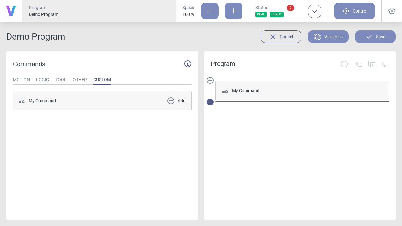
Fig. 40 Inserting a command into an existing robot program
The Maker
To open the Maker, take the following steps:
Click the settings icon
 .
.Open the COMMANDS tab.
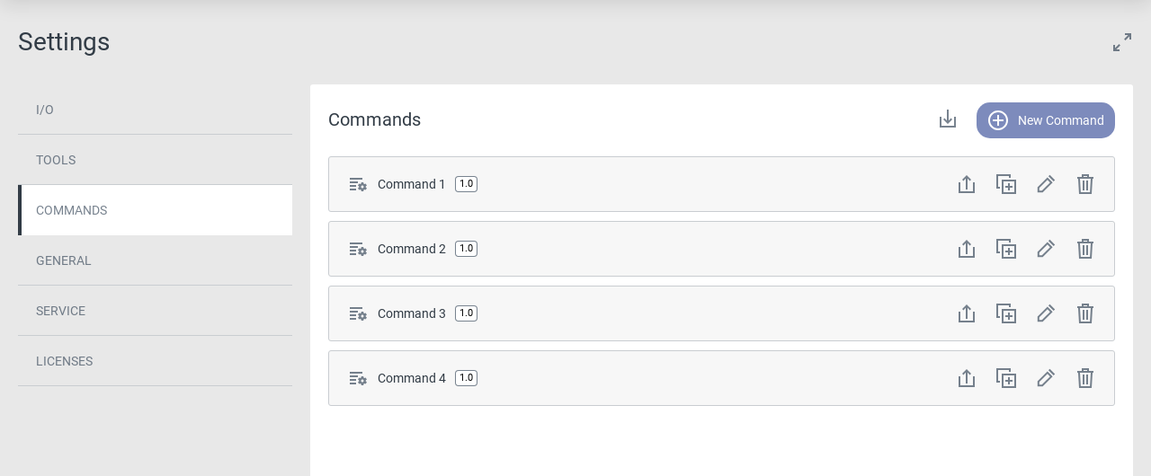
Fig. 41 The Maker can be found in the settings menu
Now you can take several actions:
To create a new command, click the New Command button.
To import an existing command from your computer, click the import icon
 .
.To export an existing command to your computer, click the export icon
 .
.To create a duplicate of an existing command, click the copy icon
 .
.To edit an existing command, click the edit icon
 .
.To delete an existing command, click the delete icon
 .
.
After opening a command in the Maker it is displayed in a split-screen view. On the left side is the editor and on the right side the command preview. On the top left side, above the editor, the command name is displayed. This name will be shown in the program and command library. It can be edited by changing the commandName attribute of the command in the UI Code.
The editor itself contains two sections, PYTHON and UI, which store the two parts each command consists of:
The PYTHON tab contains the Python code that is executed when the program is run. This code constitutes the logical structure of the command including all robot commands. Via the Python code it is possible to access the command’s UI elements and use their template variables as input values.
The UI tab contains the UI code which defines the command specific user interface. This code includes all UI elements and widgets in a JSON syntax. New widgets can be inserted from the template library and then parametrized individually.
Python Editor
The PYTHON section consists of a text editor and a snippet library at the bottom which contains typical commands and control structures for Python programming.
Snippets are concise examples of frequently used code sections and can be inserted into the Python code by clicking
them. They are intended as short examples for often used code samples. The full documentation of the robot related
classes and functions is linked at the top and can be opened by clicking the info icon  .
.
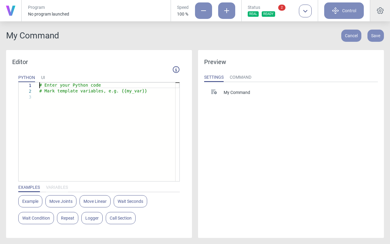
Fig. 42 The Python editor consists of a text editor and a snippet library
The Python editor contains some additional features:
As displayed below, code sections can be collapsed and expanded. This can help to keep a better overview of your Python code.
A search and replace menu is activated when pressing Ctrl + F.
Vertical gray lines show the indentation levels of the code. This way, you can visually check the necessary indents for your Python code and quickly orient yourself within nested control structures.
Fig. 43 Some code sections can be collapsed and expanded
To view all built-in code editing functions and shortcuts, open the command palette by right clicking in the text editor or by pressing F1.
Fig. 44 The editor context menu
UI Editor
The UI section has a similar structure with a text editor and a snippet library for insertion of UI elements.
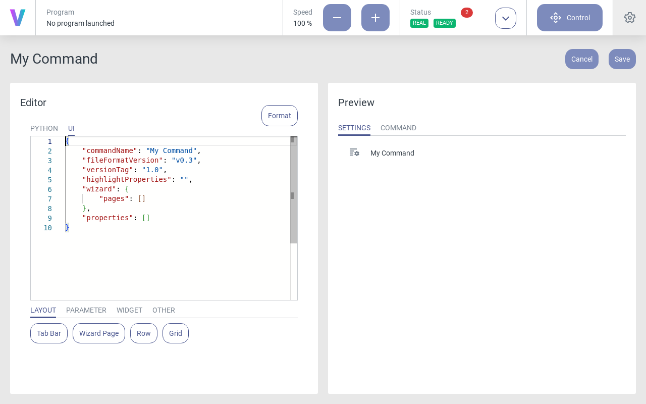
Fig. 45 The UI editor consists of a text editor and a snippet library
To insert a new element into an empty UI code, take the following steps:
Move the cursor between the square brackets of the properties attribute.
Click on the desired element to insert it.
UI elements can be chosen from the four categories of the snippet library. An overview of the available elements is given on the UI Elements page.
The syntax of the UI code is explained in detail on the UI Code page. To adapt the indents to the pre-defined document style, use the Format button in the upper right corner.
UI Preview
The UI preview renders the graphical interface as it is shown when the command is used in a robot program. The rendering is carried out continuously during the editing process, so that changes in the UI code section will immediately appear in the preview.
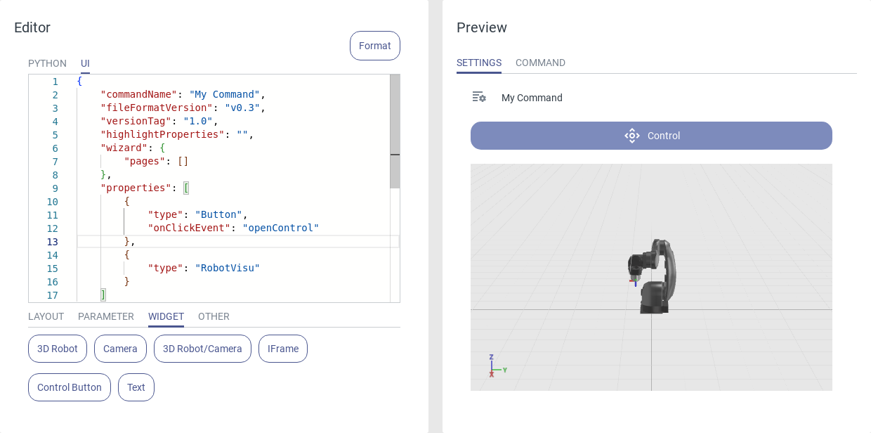
Fig. 46 The UI preview renders the graphical interface while editing the code
UI Error Output
The UI code must follow a strict syntax, which is explained on the UI Code page. The UI rendering will only be executed if there are no syntax errors. Otherwise an error message with a detailed description of the syntax error is displayed in the preview window. This facilitates quick fixing of errors in the UI code.
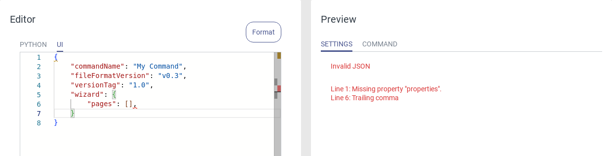
Fig. 47 The UI preview lists errors in your UI code
UI Code
Syntax
The UI code must follow the JSON syntax strictly in order to be rendered correctly. The JSON syntax supports two data structures:
A collection of name/value pairs, surrounded by curly brackets. Names and values are inserted as strings and separated by a colon (:).
A list of values, surrounded by square or curly brackets. Multiple values are separated by commas.
{
    "name 1": "value 1",
    "name 2": "value 2"
}

"list": [ {"name a": "value a", ... }, {"name b": "value b", ... } ]
These two structures can be combined and nested as desired:
{
    "name 1": "value 1",
    "name 2": {
         "name a": "value a",
         "name b": {
             "name x": "value x",
             "name y": "value y"
         }
     }
}
All UI elements of a command are stored as a list, located in the document root in the properties attribute.
Document root
The outermost container is called the document root of the UI code and also consists of a value/name pair collection. The document root contains meta information and all UI elements of the command. The root of an empty command looks like this:
{
    "commandName": "new-command",
    "fileFormatVersion": "v0.3",
    "versionTag": "v1.0",
    "highlightProperties": "",
    "wizard": {
        "pages": []
    },
    "properties": []
}
Document Root Attributes
commandName: The name of the command, as displayed in the HMI.
fileFormatVersion: The version of the JSON file structure. This attribute should not be changed.
versionTag: The version number of this command. The value is v1.0 per default and can be incremented manually with every new version. See Versioning for details.
highlightProperties: Information to be displayed in the program outline. See Highlight Properties for details.
wizard: Contains a list of pages that can be used to add a step-by-step instruction to your command. See Wizard for details.
properties: The main attribute of each command that contains all UI elements (except for the wizard pages).
extendedPage (optional): With the Extended Page attribute the command area can be extended in the program editor to visualize the camera stream or the 3D robot widget.
infoBox (optional): The info box can be used to visualize expressions in the command block within the program, analogous to the built-in Conditional command. See Info Box for details.
sections (optional): The sections attribute enables the creation of container commands, for instance to create custom conditional commands. See Sections for details.
librarySubSections (optional): Library Subsections help to structure multiple commands within the command library.
Extended Page
The extended page attribute is a list that can take multiple “type” elements that are shown on the page.
"extendedPage": [
   {
      "type": "RobotVisu"
   },
   {
      "type": "CameraStream"
   },
   {
      "type": "RobotVisuCameraToggle"
   }
]
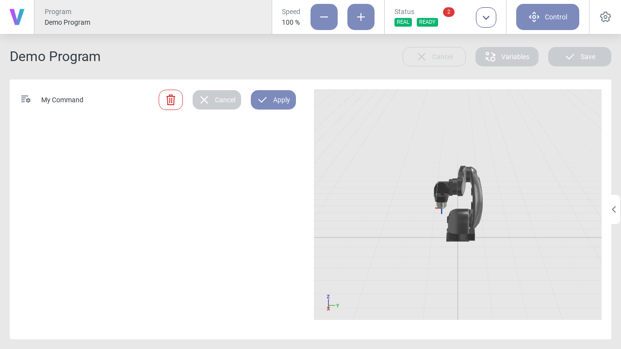
Fig. 48 The extended page can be folded out from the program editor by clicking the small arrow in the center
Library Subsections
With library subsections it is possible to structure the command library and divide commands in various categories.
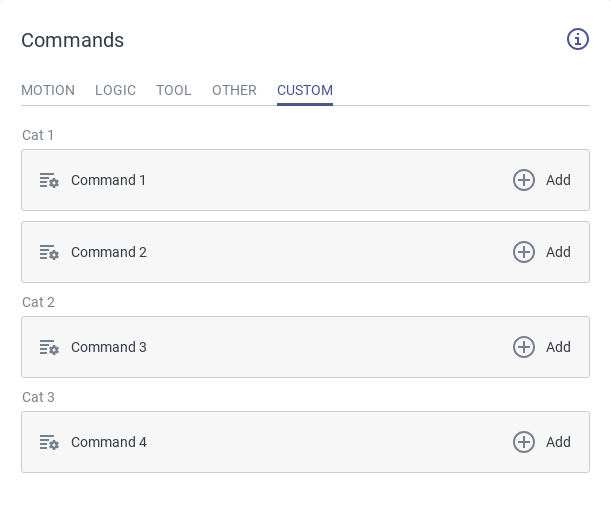
Fig. 49 Different subsections within in the command library
UI Elements
The available UI Elements can be categorized into four main groups:
Layout: Layout elements allow structuring UI elements within the command interface.
Parameter: Parameter elements can receive user input. They provide template variables which are accessible within the Python code.
Widget: Widget elements enable interaction with the robot and visualization of variables, camera streams, etc.
Other: This tab contains elements for code validation and an empty command structure.
Layout
Parameter
Widget
Other
UI Element Attributes
Next to the element-specific default attributes, most UI elements have optional attributes to add additional configurabilty. Not all optional attributes are available for all UI elements, but their usage is explained in the following paragraph:
disabled: The element is disabled if the given expression string evaluates to true
"disabled": "{{my_var_1}} == true and {{my_var_2}} == 42"
info: An info icon is shown next to the element title that displays the entered string.
visible: The element is only displayed if the given expression string evaluates to true (see disabled).
width: Define the width of the element. It can be specified in percent (%), pixels (px) or points (pt).
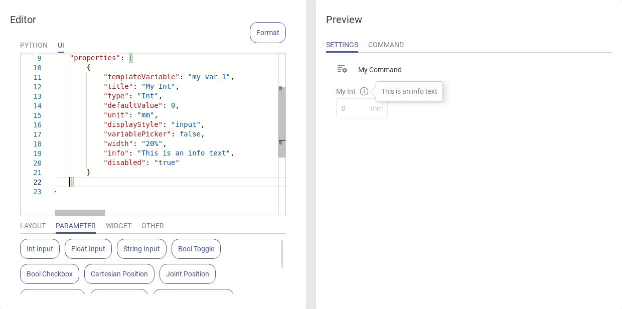
Fig. 50 A disabled UI element with an info icon scaled to 20 % width
Templating
Templating facilitates the use of user inputs from UI elements within the Python code. Each parameter UI element has an attribute templateVariable which is assigned a generic name but can be given a more meaningful name by the user. The value of this variable, taken from the user interface, is then inserted into the Python code before running the program.
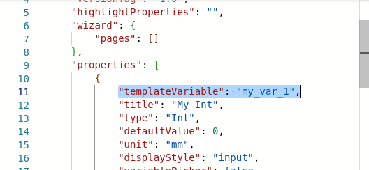
Fig. 51 Setting the name of a template variable
Variable Types
Depending on the UI element the template variable can be of different data types. It is specified by the type attribute. For some elements the type can be changed (e.g. Textbox), for others the type is defined by the element (e.g. Bool Toggle).
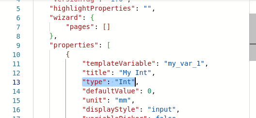
Fig. 52 Setting the type of a template variable
The correlation between input element, the type descriptor in the UI code and the data type in Python is listed below.
Input element |
Type descriptor |
Data type |
|---|---|---|
Int Input |
Int |
<class ‘int’> |
Float Input |
Float |
<class ‘float’> |
String Input |
String |
<class ‘str’> |
Bool Toggle |
Bool |
<class ‘bool’> |
Bool Checkbox |
Bool |
<class ‘bool’> |
Cartesian Position |
CartesianPosition |
<class ‘yrarm.Pose’> |
Joint Position |
JointPosition |
<class ‘yrarm.JointPose’> |
Enum Dropwdown |
Enum |
<class ‘int’|’string’> |
Enum Buttons |
Enum |
<class ‘int’|’string’> |
Predefined Dropdown |
PreEnum |
<class ‘int’|’string’> |
Example: Use a variable in Python
To use a template variable in the Python code, wrap the variable name in double curly braces. This way the template {{my_var}} is replaced by the actual value of my_var from the user interface when a program is generated.
self.variables['{{var_name}}'] = {{var_value}}
Info Box
The info box attribute enables displaying text and variable values within the command block of the program.
"infoBox": "Selected: ID: {{my_enum.id}} displayName: {{my_enum.displayName}}",
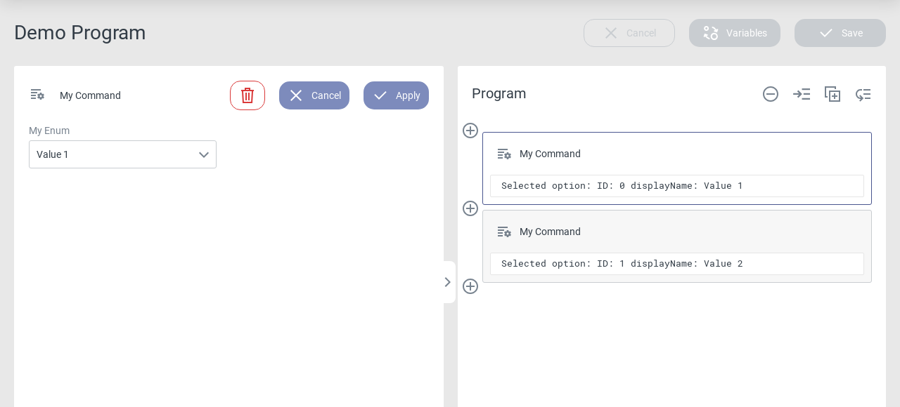
Fig. 53 The info box is displayed inside the command block
Instead of a string, multiple texts can also be used in an array. The visible attribute defines which text(s) are displayed.
"infoBox": [
 {
     "visible": "{{var_1}} == 0",
     "text": "My String with {{var_2}}"
 },
 {
     "visible": "{{var_1}} == 1",
     "text": "My String with {{var_3}}"
 }
]
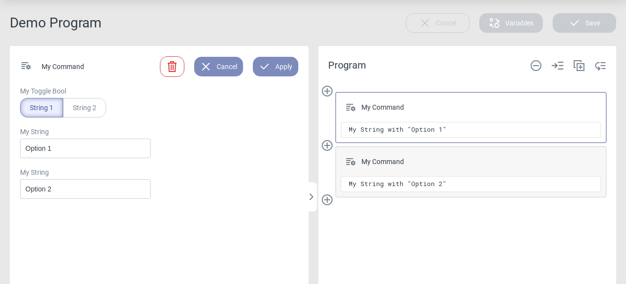
Fig. 54 Showing different strings depending on the visibility attribute
Highlight Properties
Highlight properties offer the ability to display any additional text or the command’s parameters in the program outline. This can be helpful to distinguish between several instances of a command in a program.
Any template variable can be shown in the highlight properties by using double curly braces around the variable name in the highlightProperties attributes of the document root.
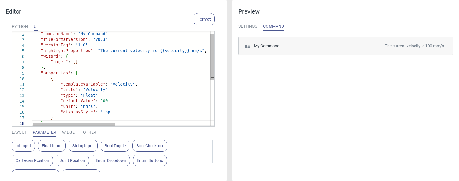
Fig. 55 Showing the current value of the velocity input field in the highlight properties
It is possible to submit an array with multiple fields, each containing a text and a visibility attribute. This way it is possible to highly customize the highlight properties by changing the text depending on the parametrization of the command.
"highlightProperties": [
    {
        "visible": "{{var_1}} == 0",
        "text": "My String with {{var_2}}"
    },
    {
        "visible": "{{var_1}} == 1",
        "text": "My String with {{var_3}}"
    }
]
Sections
Sections allow the creation of container commands, such as the built-in Conditional command, which enable branching of the program sequence within the program editor.
The sections attribute of the document root is optional, so it needs to be added manually, e.g. by pressing Ctrl + Space in the UI editor. It takes a list of strings, each string creating a new section in the command outline. Multiple sections can have the same name since they are called by their index and not their name, however it is recommended to use unique and meaningful names. A section name must consist only of letters and numbers; spaces and special characters are not allowed and will cause an error message in the UI preview.
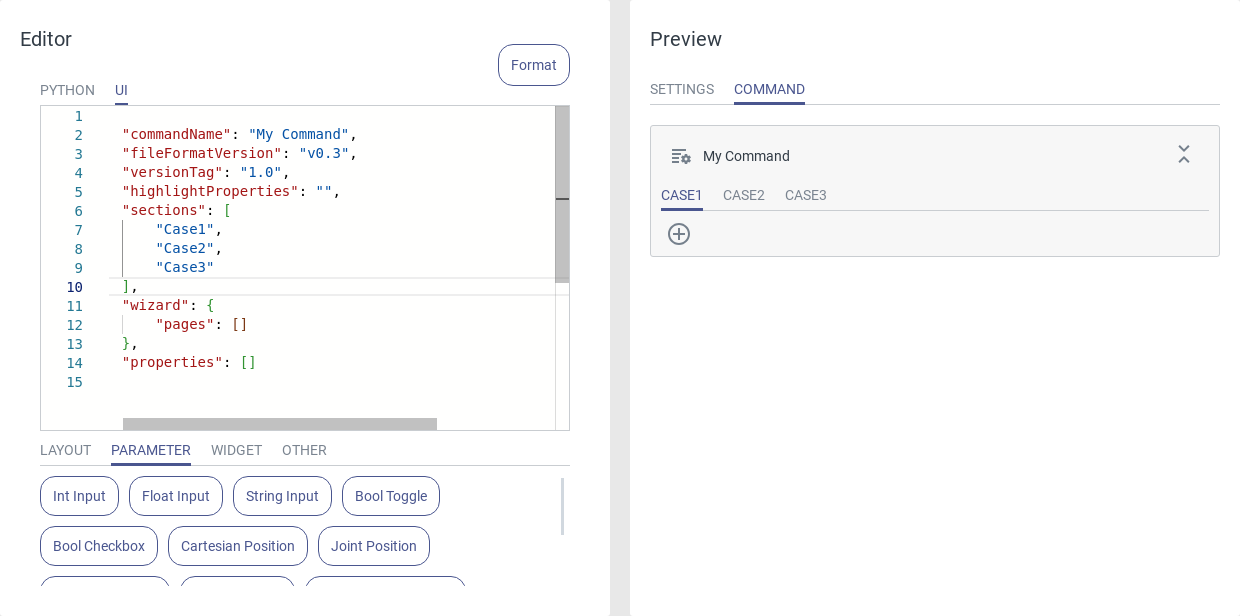
Fig. 56 An empty command with three sections in the command preview
In the Python editor the content of each section can be called via the call_section() command, which is also available as a command snippet. This command takes the index of the section to be called, starting at 0. Thereby it is possible to call the different sections depending on custom conditions (see Info Box) or in a customizable order.
Versioning
Commands have a versioning system to distinguish between different versions of the same command. This is done by assigning each command a unique ID (not visible) and a JSON attribute versionTag. From this, the system will automatically detect which version of a given command is currently installed and used inside a program.
File Format Version
The file format version is a command attribute which indicates the expected structure of the JSON file. Different software versions might have different default file format versions, but they are always backwards compatible with older commands, or, in case of non-certified commands, the file format version will be migrated automatically. Certified commands with an older file format version will be displayed as outdated, but will continue to work just fine. In this case, check if a newer version of the command is available.
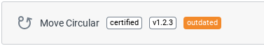
Fig. 57 Certified command with an outdated file format version
In case the actual JSON content of a command does not match with the expected structure of the file format version (e.g. a required attribute is missing), the command will be displayed as invalid. The UI preview will give a detailed instruction on which attribute is broken and how to fix it.
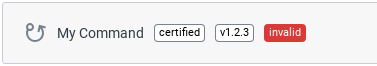
Fig. 58 Certified command with invalid content
Version Tag
The attribute versionTag can be used to mark different versions of the same command. It can be manually changed in the document root of each command. The version tag will be shown next to each command in the settings menu.
When importing a command that already exists in a different version, you will be asked if the existing command shall be overwritten by the imported one. A pop-up will show the attributes that have been changed between both versions and in which programs the command is currently used. All programs will be automatically updated with the imported version of the command.
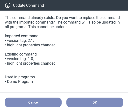
Fig. 59 Importing a different version of an existing command
Tips and Tricks
Create Backups of Commands
Programs contain only references to their commands but not the commands themselves. It is not possible to retrieve commands from a program, so make sure to back up your programs as well as your commands.
Use the Python API Documentation
Click the info icon in the top right corner of the editor to view the documentation of the Python API. The
documentation contains all classes and methods that can be used to interact with the robot and lists all method
parameters with a detailed description.
Press Ctrl + Space for Autocompletion
Inside the UI editor, press Ctrl + Space to see a list with all available attributes for each element.
Collapse Sections of the UI Code
Inside the UI editor, code sections can be collapsed to focus on different parts of your command.
Verify Correct Templating Using the Python Code Widget
Insert a Python Code widget to view the Python code resulting from the templating. You may also want to insert a Template Code widget to compare the code before and after the variable replacement.
5.1.2. Layout
Tab Bar
Use a Tab Bar to create multiple tabs within a command. This is helpful for improving the structure of commands by dividing UI elements into different categories.
A tab bar contains these attributes:
type: TabBar.
selectedTab: Specify the initially selected tab by its title.
tabs: List of the tabs. Each tab must have the following attributes:
title: Name that is displayed at the top of the tab.
properties: A list that contains all UI elements of this tab.
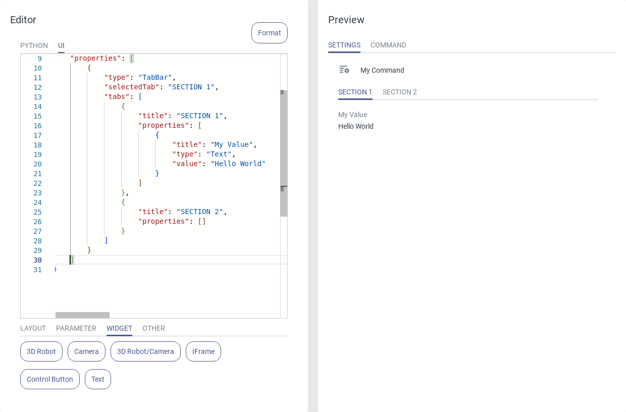
Fig. 60 Usage of the tab bar.
Wizard
A Wizard can be used to create a step-by-step instruction by arranging elements on multiple pages. If the wizard is parameterized, the wizard pages are displayed first and afterwards the UI elements defined in the main properties attribute if the wizard is completed.
The wizard has the following attribute:
pages: List of wizard pages.
Each wizard page contains these attributes:
title: Title of the page, which is displayed in the wizard bar.
properties: A list containing all UI elements within the wizard page.
Optional:
nextButtonDisabled: The Next/Finished button of the wizard page is only enabled if the given expression string evaluates to true.
The Next button opens the subsequent wizard page. The Restart button is used to return to the first wizard page. All configured parameters will be reset.
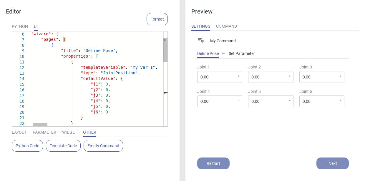
Fig. 61 First page of the wizard
The Back button can be used to navigate back to the previous page. When you are on the last wizard page, you can click the Finish button to end the wizard and go to the main command page.
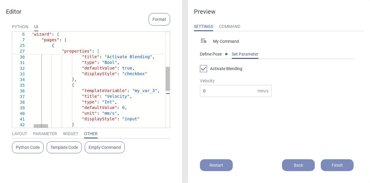
Fig. 62 Second page of the wizard
When the wizard is finished, the UI elements of the main page are displayed. The wizard can be restarted using the corresponding button at the bottom of the page.
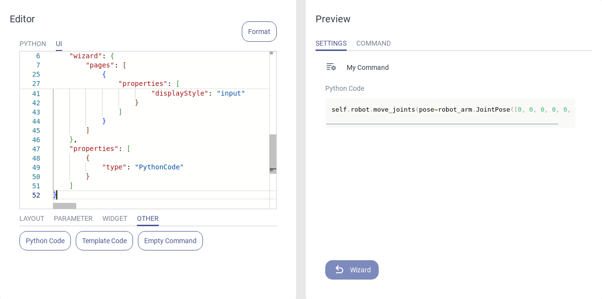
Fig. 63 Finished wizard
Row
Use a Row to arrange several elements next to each other.
A row contains these attributes:
type: Row.
title: Heading above the menu.
properties: A list containing all UI elements within the row.
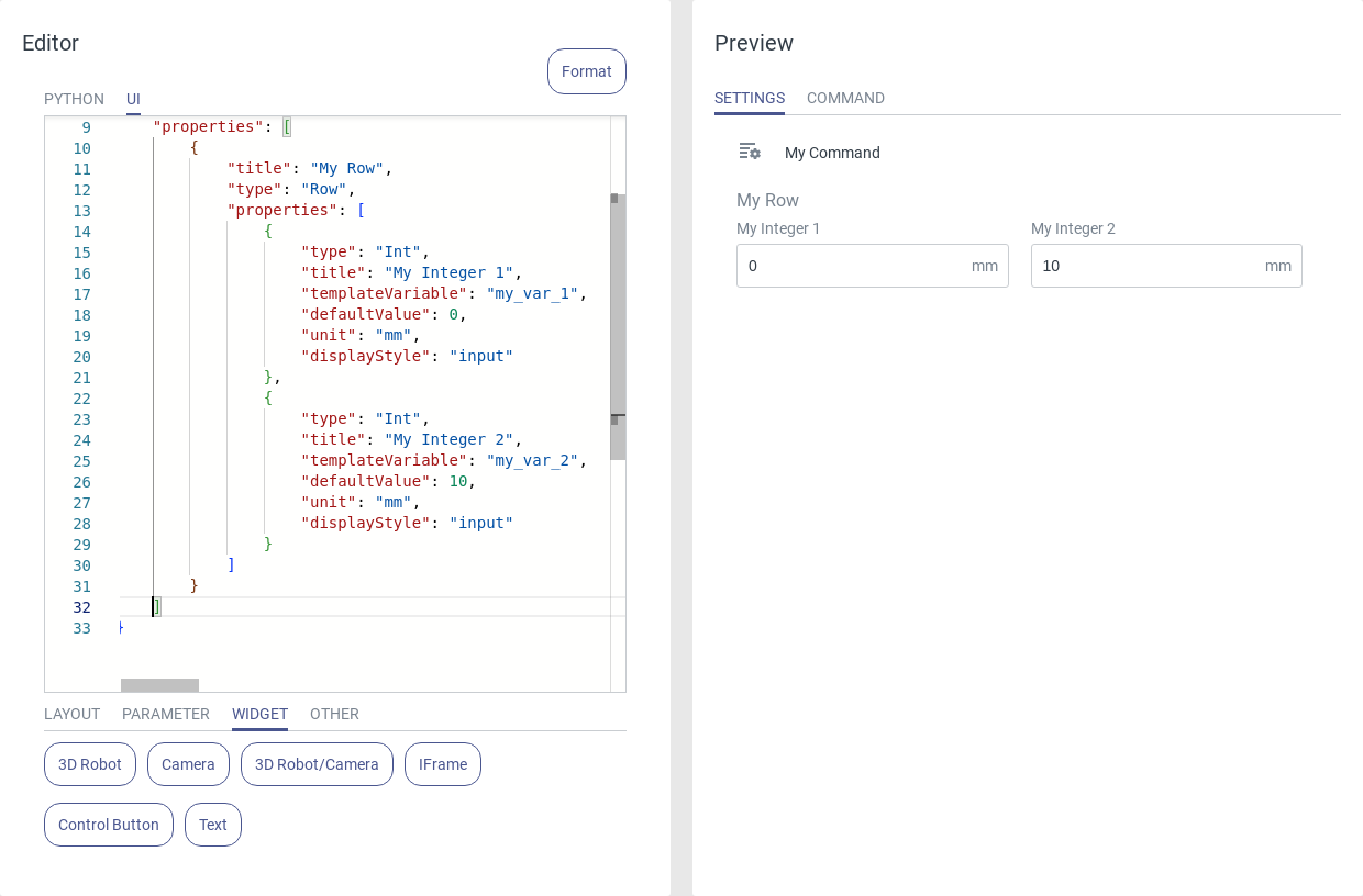
Fig. 64 Usage of the row
Grid
Use a Grid to arrange elements across multiple rows and columns.
A grid contains these attributes:
type: Grid.
title: Heading above the menu.
columnNum: Number of columns.
properties: A list containing all UI elements within the grid.
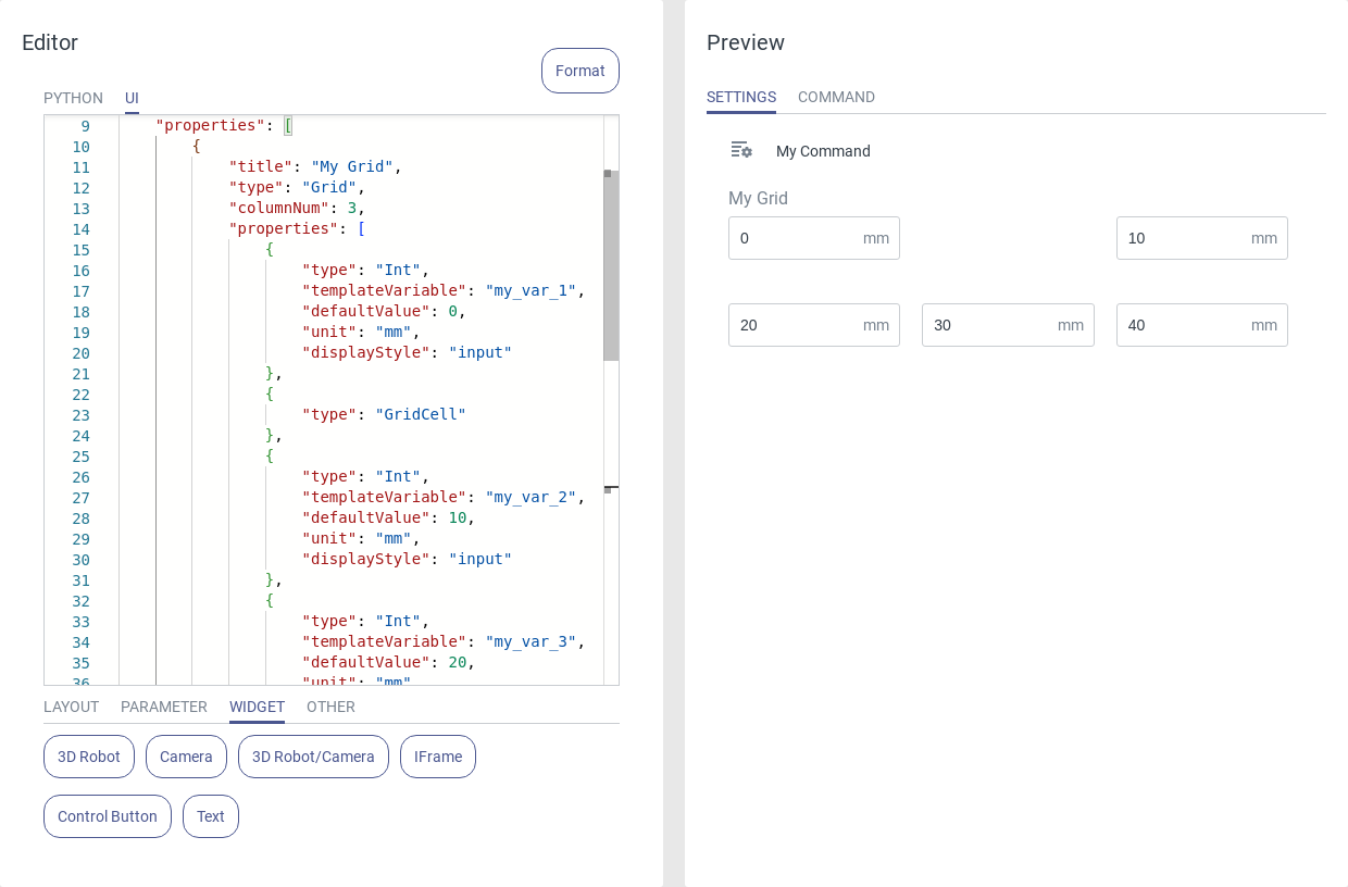
Fig. 65 Usage of the grid
The elements are sequentially inserted into the grid and visualized based on the specified number of columns. A GridCell element can be used to insert an empty element:
{
    "type": "GridCell",
}
5.1.3. Parameters
Textbox
Textboxes can be used to enter integers, floats and strings.
A textbox contains these attributes:
templateVariable: Name of the template variable (output).
title: Heading above the box.
type: Type descriptor for the UI code. Select Int, Float or String.
defaultValue: Initial content of the textbox.
unit (only int and float): The unit of the input value, displayed at the right side of the input field.
placeholder (only string): The text that is displayed inside the textbox when no user input has been entered.
displayStyle: Leave at input for a textbox.
variablePicker: When activated a dropdown menu with all program variables of the selected type is added.
Optional:
max (only int and float): The maximum value that can be entered.
min (only int and float): The minimum value that can be entered.
Int
Use the type Int for numerical parameters that can be specified as whole numbers.
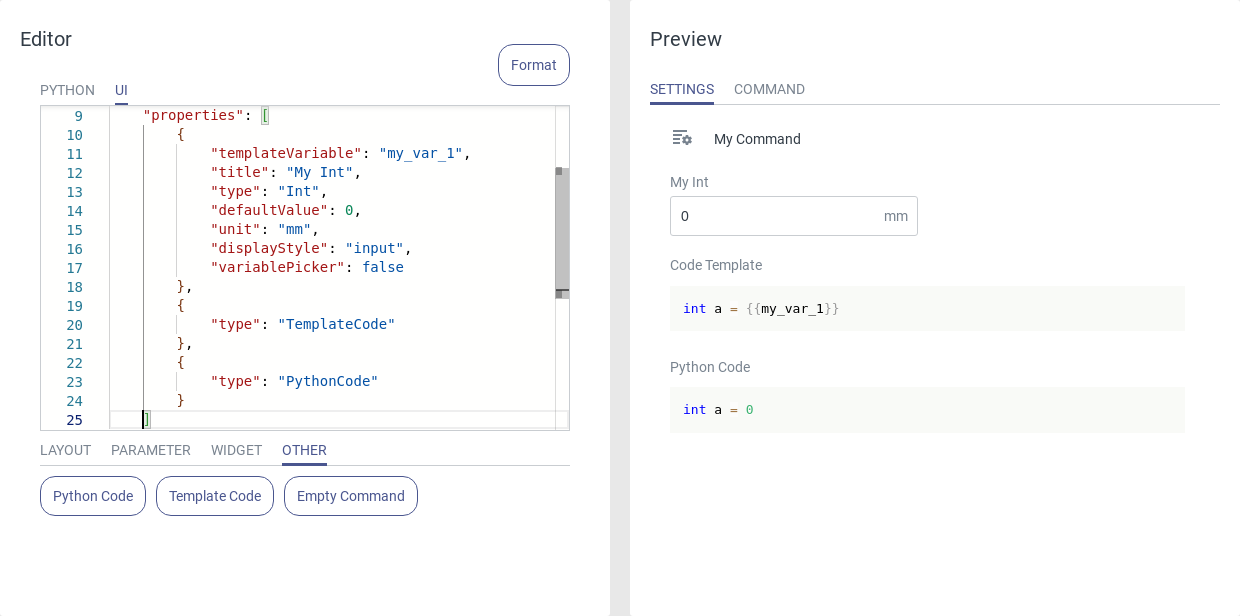
Fig. 66 Usage of the Integer input text box
Float
Use the type Float for numerical parameters.
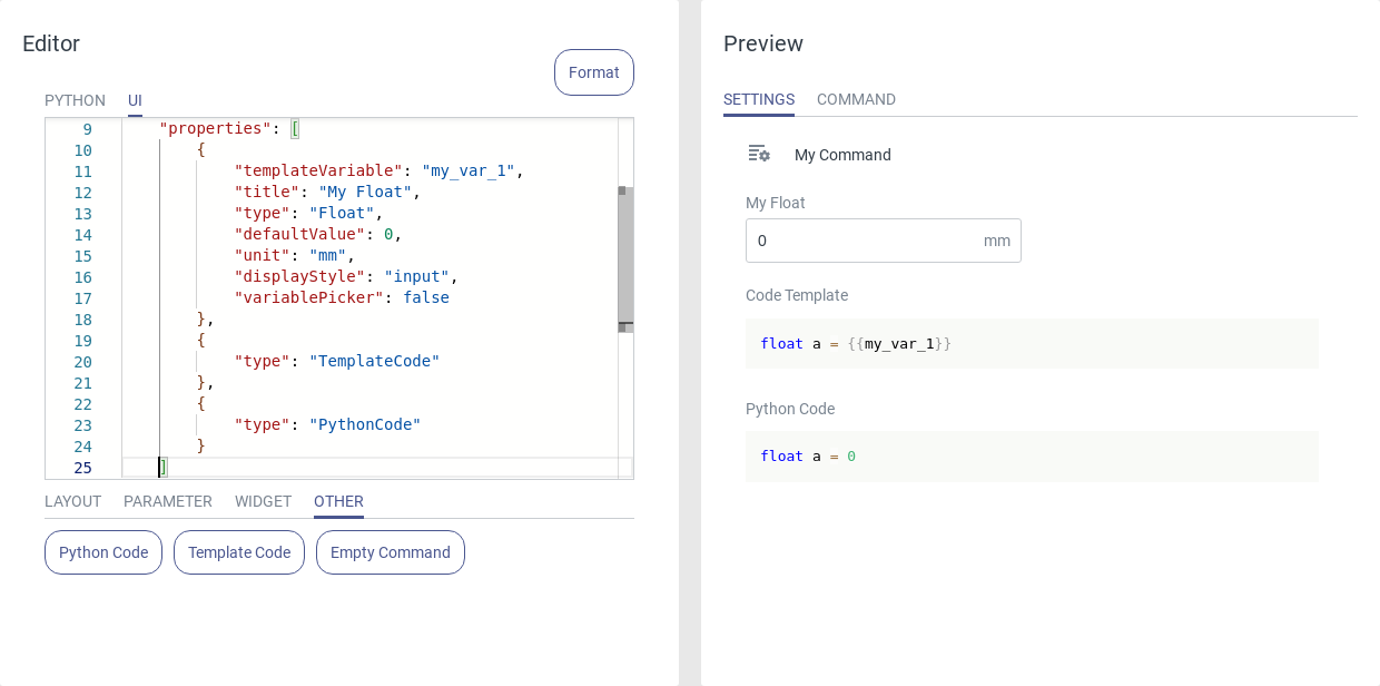
Fig. 67 Usage of the Float input text box
String
Use the type String for text inputs. The input will be interpreted as a Python string, including quotation marks. To get the input without quotation marks the notation {{my_var.raw}} can be used.
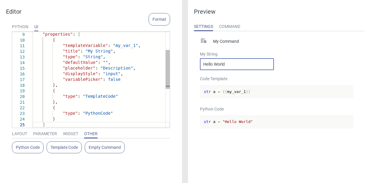
Fig. 68 Usage of the String input text box
Bool Toggle
A Bool Toggle can be used to turn a particular setting on or off or choose between two configurable options. The template variable resolves to a Boolean variable.
A bool toggle contains these attributes:
templateVariable: Name of the template variable.
title: The title above the element.
type: Bool.
defaultValue: Initial state of the bool toggle (true/false).
displayStyle: Leave at toggle for a bool toggle.
Optional:
titleLeft: Text that is displayed on the left side of the toggle
titleRight: Text that is displayed on the right side of the toggle
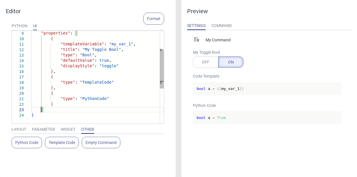
Fig. 69 Usage of the bool toggle
Note
A Boolean variable can be set via two different styles — toggle and checkbox. Both styles resolve to the same Python code.
See also: Bool Checkbox.
Bool Checkbox
A Bool Checkbox can be used to activate a particular setting or to consider a special condition during the execution of the command. The template variable resolves to a Boolean variable.
A bool checkbox contains these attributes:
templateVariable: Name of the template variable.
title: The title above the element.
type: Bool.
defaultValue: Initial state of the checkbox (true/false).
displayStyle: Leave at checkbox for a checkbox.
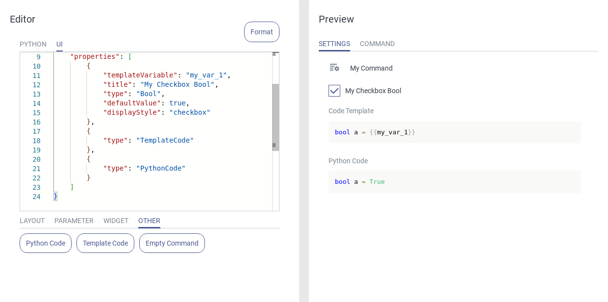
Fig. 70 Usage of the checkbox
Note
A Boolean variable can be set via two different styles — toggle and checkbox. Both styles resolve to the same Python code.
See also: Bool Toggle.
Cartesian Position
A Cartesian Position can be used to enter a robot pose in various Cartesian coordinate systems.
A Cartesian position contains these attributes:
templateVariable: Name of the template variable.
title: Name of the position.
type: CartesianPosition.
defaultValue: The initial pose. If left empty, the current robot pose will be used automatically when inserting the command to a program.
csDisplayStyle: Keep at dropdown to show a dropdown menu with the available coordinate systems. Set to none to hide the dropdown menu.
csPossibleValues: Ordered list of options for the reference coordinate system that are shown in the dropdown menu.
currentPoseBtn: Add a Current Pose button. This button updates the input fields with the current pose in the selected coordinate system.
variablePicker: When activated, a dropdown menu with all Cartesian position program variables is added.
moveToPoseBtn: Add a button that moves the robot to the currently entered pose.
Optional:
ControlBtn: Add an additional control button to the pose element which opens the control panel.
- moveToPoseBtnOptions: Add a list of multiple attributes to parametrize the motion of the Move To Pose button.
moveType: Options are ‘LIN’ (linear) and ‘PTP’ (point to point).
velocityTranslation (only for LIN): Translational velocity in m/s.
accelerationTranslation (only for LIN): Translational acceleration in m/s².
velocityScaling (only for PTP): Velocity of the point to point movement (between 0 and 1.0).
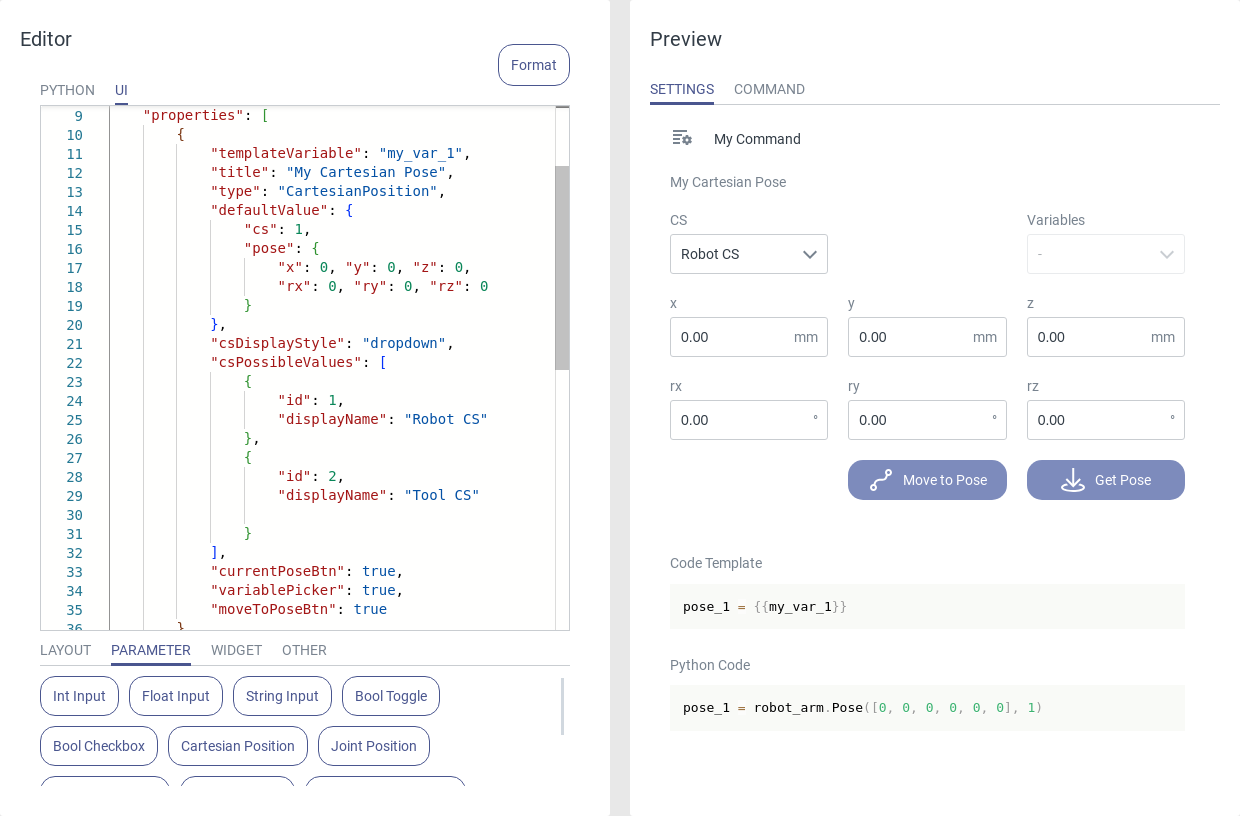
Fig. 71 Usage of the Cartesian position
The template variable resolves to a yrarm.Pose variable and stores the Cartesian coordinates of the pose, including the reference coordinate system.
Joint Position
A Joint Position can be used to enter a robot pose in the joint coordinate system.
A joint position contains these attributes:
templateVariable: Name of the template variable.
title: Name of the position.
type: JointPosition.
defaultValue: The initial pose. If left empty, the current robot pose will be used automatically when inserting the command to a program.
currentPoseBtn: Add a Current Pose button. This button updates the input fields with the current joint coordinates
variablePicker: When activated, a dropdown menu with all joint position program variables is added.
moveToPoseBtn: Add a button that moves the robot to the currently entered pose.
Optional:
ControlBtn: Add an additional control button to the pose element which opens the control panel.
- moveToPoseBtnOptions: Add a list of multiple attributes to parametrize the motion of the Move To Pose button.
moveType: Options are ‘LIN’ (linear) and ‘PTP’ (point to point).
velocityTranslation (only for LIN): Translational velocity in m/s.
accelerationTranslation (only for LIN): Translational acceleration in m/s².
velocityScaling (only for PTP): Velocity of the point to point movement (between 0 and 1.0).
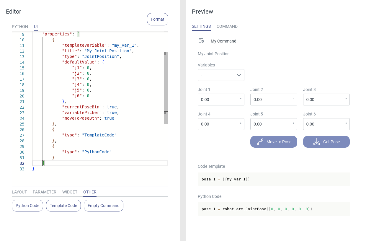
Fig. 72 Usage of the joint position
The template variable resolves to a yrarm.JointPose variable which stores the joint angles.
Enum Dropdown
An Enum Dropdown menu can be used to provide a choice of predefined options to the user.
An enum dropdown menu contains these attributes:
templateVariable: Name of the template variable.
title: Heading above the menu.
type: Enum.
defaultValue: Initially selected value of the dropdown menu.
possibleValues: An ordered list of all options and their id.
displayStyle: dropdown. Set to radioButtons to change the element to a radio button enum.
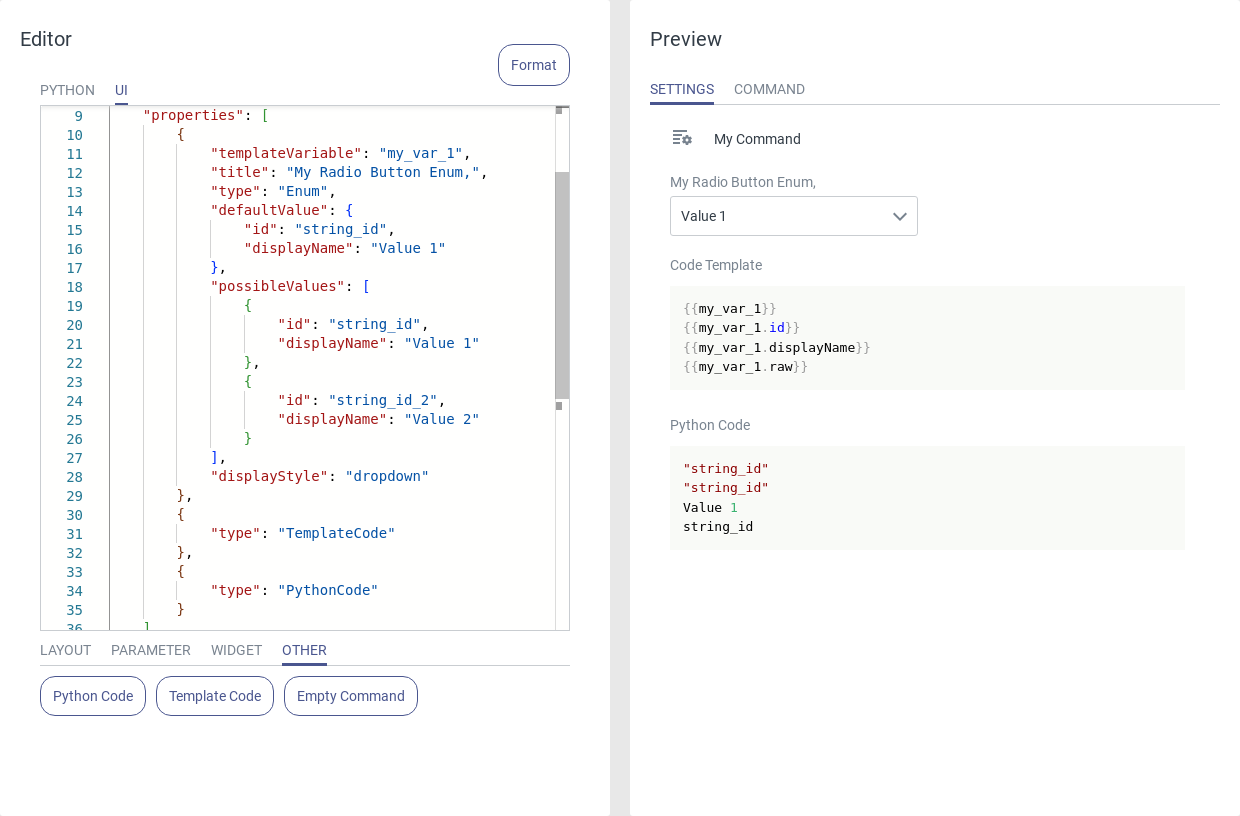
Fig. 73 Usage of the enum dropdown
Each option must have an id and a displayName. The id can be of type Int, Float or String. The displayName must be of type String and is shown in the UI element.
{
    "id": 0,
    "displayName": "Value 1"
}
The template variable resolves to the id of the selected value, which can be treated as a variable of the configured type inside the Python editor. To get the display name use this notation: {{my_var.displayName}}. If the id is of type String you can use the notation {{my_var.raw}} to get the value without quotation marks. To append further options to the dropdown menu, add another section with a unique id, separated by a comma.
Note
A selection menu can be set via two different styles — dropdown and radio buttons. Both styles resolve to the same Python code.
See also: Enum Buttons.
Enum Buttons
A Enum Button menu can be used to provide a choice of predefined options to the user.
A enum button menu contains these attributes:
templateVariable: Name of the template variable.
title: Heading above the menu.
type: Enum.
defaultValue: Initially selected value of the button menu.
possibleValues: An ordered list of all options and their id.
displayStyle: radioButtons. Set to dropdown to change the element to a dropdown enum.
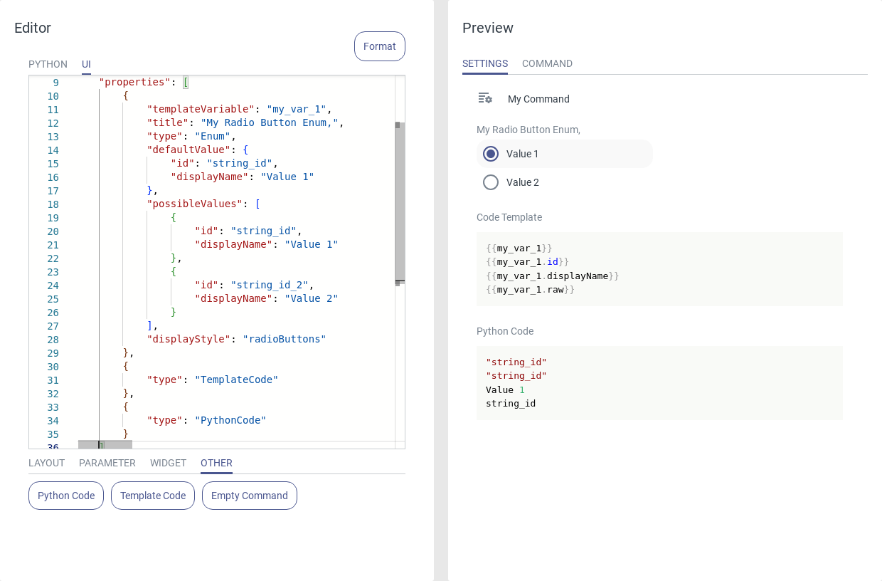
Fig. 74 Usage of the enum button
Each option must have an id and a displayName. The id can be of type Int, Float or String. The displayName must be of type String and is shown in the UI element.
{
    "id": 0,
    "displayName": "Value 1"
}
The template variable resolves to the id of the selected value, which can be treated as a variable of the configured type inside the Python editor. To get the display name use this notation: {{my_var.displayName}}. If the id is of type String you can use the notation {{my_var.raw}} to get the value without quotation marks. To append further options to the radio button menu, add another section with a unique id, separated by a comma.
Note
A selection menu can be set via two different styles — dropdown and radio buttons. Both styles resolve to the same Python code.
See also: Enum Dropdown.
Predefined Dropdown
A Predefined Dropdown can be used to provide the choice between dynamic system- or tool-specific options, such as coordinate systems, tool commands, etc.
A predefined dropdown menu contains these attributes:
templateVariable: Name of the template variable.
title: Heading above the menu.
type: PreEnum.
defaultValue: Initially selected value of the dropdown menu.
possibleValues: The variable type of the enum. Options are CameraProfiles, CoordinateSystems, RobotState, Tools and ToolState.
displayStyle: dropdown. Set to radioButtons to change the element to a predefined radio button enum.
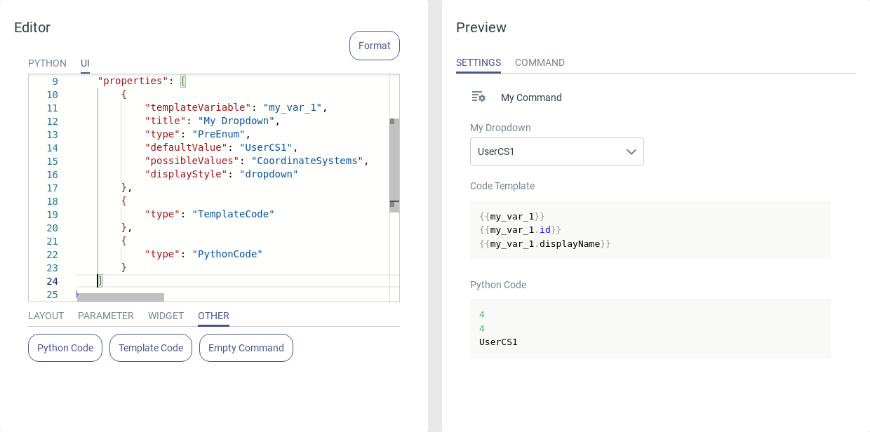
Fig. 75 Usage of the predefined dropdown
The template variable resolves to different variable types in Python, depending on the configured possibleValues-attribute.
Attribute |
Data type |
|---|---|
CameraProfiles |
String |
CoordinateSystems |
Integer |
RobotState |
Integer |
Tools |
String |
ToolState |
String |
If the template variable is of type String you can use the notations {{my_var.raw}} or {{my_var.displayName}} to get the value without quotation marks. If the variable is of type Integer you can use the notation {{my_var.displayName}} to get the textual value of the variable (e.g. Ready for RobotState == 5).
Variable Selector
Use a Variable Selector to select program variables from the currently active program.
A variable selector contains these attributes:
templateVariable: Name of the template variable.
title: Heading above the menu.
type: Variable.
variableType: Select the variable type. Only variables of this type will be displayed in the dropdown. Options are Int, Float, String, JointPosition, CartesianPosition.
displayStyle: dropdown.
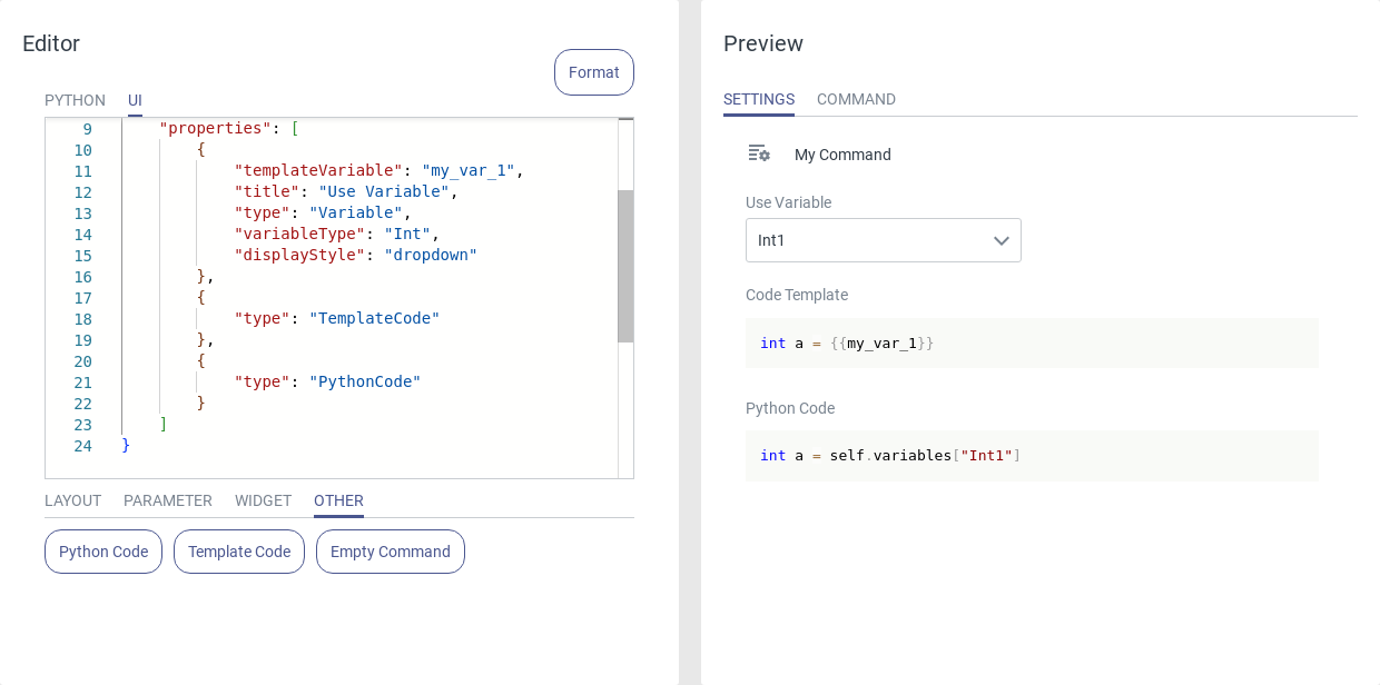
Fig. 76 Usage of the variable selector
The template variable resolves to self.variables[“my_var”].
5.1.4. Widgets
Visualization Widgets
3D Robot
Use the 3D Robot widget to insert an interactive 3D visualization of the robot.
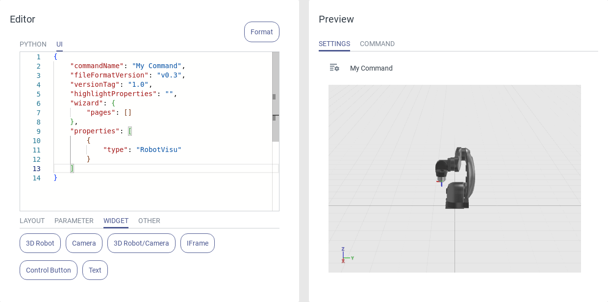
Fig. 77 Usage of the 3D robot widget
IFrame
Use the IFrame widget to display an HTML page inside your command. This can be used to display a website or any HTML-based interface of peripheral devices connected to the robot.
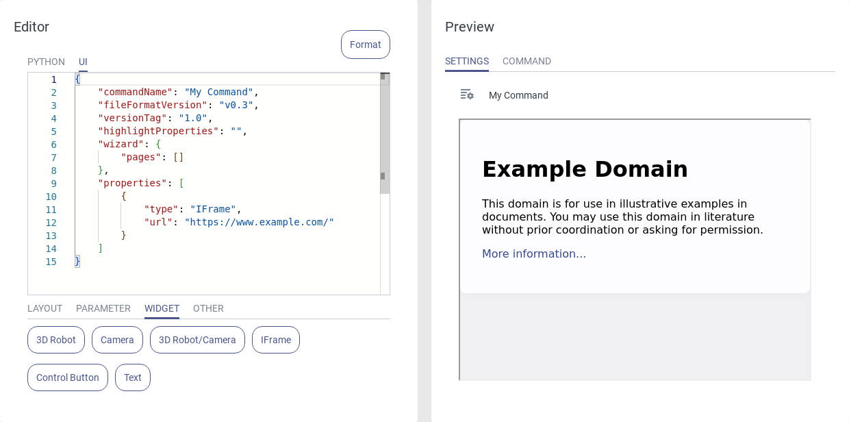
Fig. 78 Usage of the IFrame
Typical applications:
Display the image of an external camera.
Show a visual aid for the command parametrization
Note
The content of the Iframe can also be located in the local network. In this case, use the IP address of the target device.
The HMI host device must have a network connection to the target URL or IP address.
Control Button
Use the Control Button widget to open the control panel to manually control the robot. The control panel can also be opened via the control button in the navigation bar.
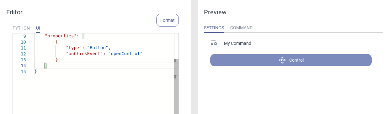
Fig. 79 Usage of the control button
Text
Use the Text widget to show descriptive text or variable values in the UI. The value of any UI variable can be displayed via the templating notation {{var_name}}.
The text widget contains these attributes:
title: The title above the element.
type: Text.
value: The text that is displayed in the element.
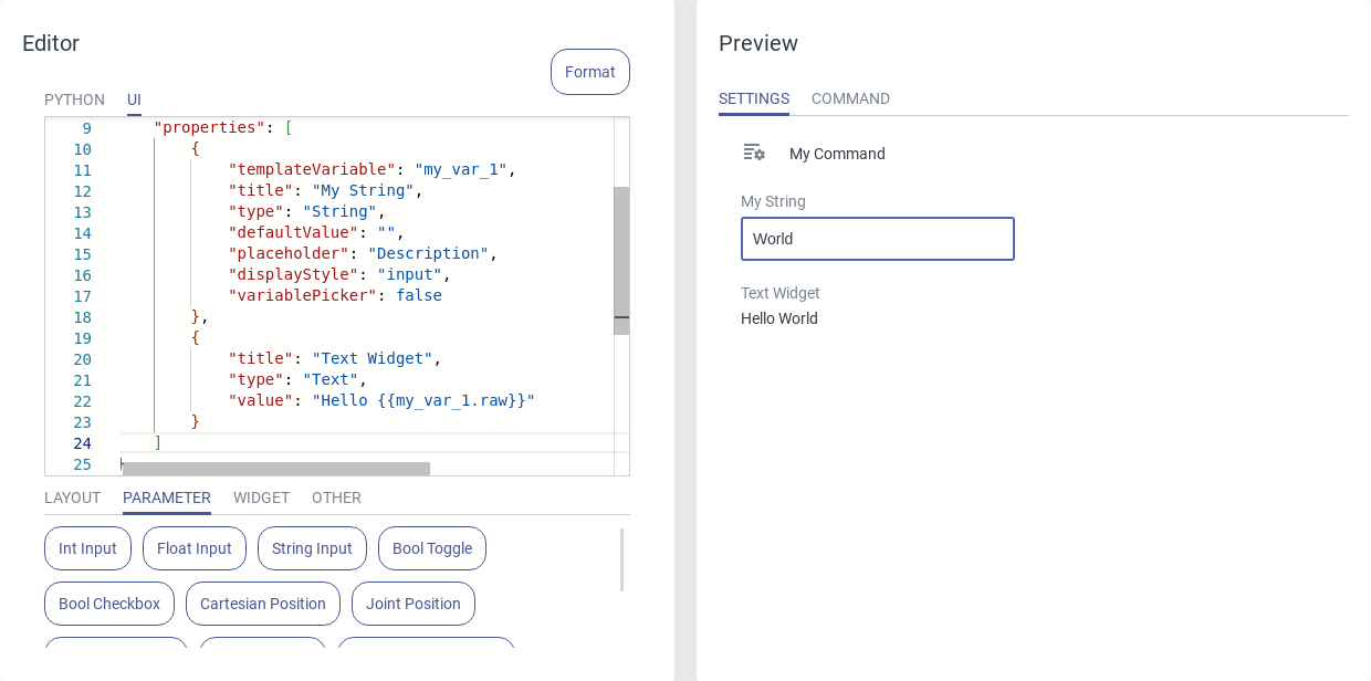
Fig. 80 Usage of the text widget
Note
In the value attribute, several lines can be separated by \n.
5.1.5. Other
Code Preview Widgets
Template Code
The Template Code widget displays Python the template code. This is the code you are editing in the Python tab. Use this widget in conjunction with the Python Code widget to validate the templating result.
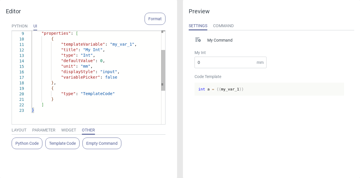
Fig. 81 Usage of the template code
Python Code
The Python Code widget inserts the values of all template variables into the Python template code. As a result, it displays the actual Python code that will be executed on the robot. Use this widget to check if the replacement of the template variables works correctly.
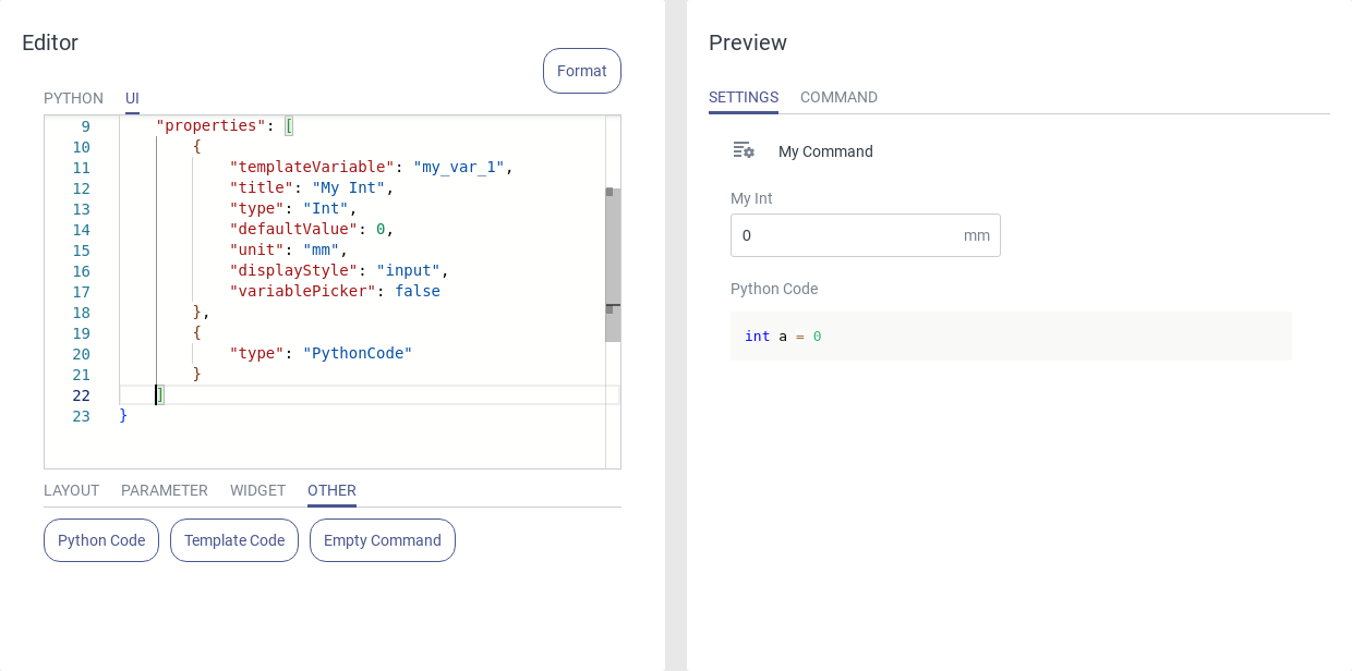
Fig. 82 Usage of the Python code
Note
If a template is inserted into the Python code which is not defined in the UI code, the template will simply be replaced by an empty string.
Empty Command
The Empty Command is a code snippet which simply contains the default document root without any modifications. It can be used to reset the UI part of a command and start from scratch. The content of an empty command looks like this:
{
    "type": "command",
    "commandName": "My Command",
    "fileFormatVersion": "v0.3",
    "versionTag": "v1.0",
    "highlightProperties": "",
    "wizard": {
        "pages": []
    },
    "properties": []
}